Polka Round: A Playful Display Font for Digital Brands
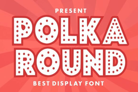
As a UI designer who ships dozens of landing pages, SaaS dashboards, and e-commerce experiences each year, I don’t reach for display fonts lightly. They need to earn their place—not just look charming in a specimen sheet. Polka Round does exactly that: it’s a bold, cheerful display font built for digital impact, not just decoration. Its thick letterforms and signature polka dot details create instant visual recognition—without sacrificing clarity or intent.
What makes Polka Round work so well on screen is its intentional contrast between playfulness and precision. The dots aren’t random embellishments; they’re rhythmically spaced, consistently sized, and carefully anchored within the letter geometry. That means it holds up at 48px on a hero banner—and still reads cleanly at 32px on a mobile CTA button. It’s not a script font or handwritten typeface, but a confident, modern display font with personality rooted in structure.
Where Polka Round Fits in Your Web Layout
This isn’t a body font—and it shouldn’t be. Polka Round thrives where attention needs direction. Use it for:
- Hero section headlines—especially for kids’ brands, creative workshops, or playful SaaS tools (think: “Design Camp for Ages 7–12” or “Build Your First App—No Code Needed”)
- Section headings in portfolio sites or course sales pages, where tone matters as much as hierarchy
- CTA buttons on landing pages or email banners (“Grab Your Spot!” or “Start Free Trial”)—its weight adds tactile emphasis
- Branded digital assets, like downloadable brand kits, social media story templates, or animated web banners
- Logo lockups for startups or boutique studios aiming for approachable differentiation
It performs especially well against clean backgrounds—light mode on white or soft pastel gradients—and gains extra energy when layered over subtle texture overlays or muted photography. On dark mode interfaces, pair it with generous letter spacing and a light stroke or subtle drop shadow to maintain legibility without flattening its charm.
Readability & Responsiveness: Real-World Considerations
Polka Round is designed for short bursts of text—not paragraphs. That’s by choice, not limitation. On mobile, keep usage to 1–2 lines max in headers. Avoid cramming it into small navigation labels or tab bars; reserve it for moments where emotional resonance outweighs functional density. Test contrast ratios rigorously: its thick strokes read strongly on light backgrounds, but on deep navy or charcoal, ensure you’re meeting WCAG AA minimums (4.5:1) with either background adjustment or subtle text effects.
The font includes standard OpenType features—ligatures, stylistic alternates, and basic multilingual support covering Latin-based languages (English, Spanish, French, German, etc.). For web use, it’s available as WOFF2 files—lightweight, fast-loading, and compatible across all modern browsers. No JavaScript dependencies. No render-blocking delays.
Smart Pairing for Balanced Digital Typography
A display font like Polka Round shines brightest when paired with intention. Think of it as the lead vocalist—not the full band. In nearly every project I’ve used it for, I pair it with a neutral sans serif: Inter, Manrope, or even system fonts like -apple-system for crisp, accessible body copy. That contrast reinforces hierarchy: Polka Round sets the mood, while the supporting font delivers information efficiently.
For editorial or lifestyle brands leaning into warmth, try pairing it with a friendly serif like Cormorant Garamond (for headings) + Lora (for body)—but only if your brand voice supports that duality. Never force contrast for the sake of trend. Polka Round’s strength is its consistency: it doesn’t waver between “fun” and “serious.” It commits to joyful clarity—and your pairing should honor that commitment.
Practical Licensing & Production Notes
Polka Round is a premium font, and its license covers web use—including self-hosted websites, client projects, online stores (Shopify, WooCommerce), SaaS platforms, and digital templates sold on marketplaces. You’ll need a commercial license for any public-facing deployment, whether embedded via @font-face or served through a CDN. Most licenses include desktop use too, so you can use it in Figma mockups, Adobe XD prototypes, or Canva brand assets without extra fees.
Importantly: avoid free “alternatives” or pirated versions. They often lack OpenType features, have inconsistent spacing, omit critical glyphs, or fail accessibility audits. A single misaligned dot or poorly hinted ‘g’ can undermine trust before users even read your headline. With Polka Round, what you see in the specimen is what renders reliably across devices—and that reliability is part of its value.
When to Choose Polka Round Over Other Display Fonts
Not every bold, rounded font fits the same role. Compared to generic rounded sans serifs, Polka Round offers distinctiveness without complexity. Unlike script fonts or overly ornate display faces, it avoids readability pitfalls at small sizes and scales predictably in responsive layouts. And unlike minimalist geometric fonts, it carries tonal warmth—making it ideal for brands that want to feel human-first, not algorithm-first.
I reach for Polka Round when the brief asks for “friendly but not childish,” “bold but not aggressive,” or “memorable but not distracting.” It works for a Montessori school’s homepage, a creative agency’s service page headline, or a subscription box brand’s seasonal campaign banner—because its personality is specific, not generic.
In digital design, type isn’t just about letters—it’s about pacing, pause, and permission. Polka Round gives users permission to smile before they scroll. It slows attention just enough to land a message. And in an interface economy competing for milliseconds of focus, that small moment of delight is where conversion begins.